Showing posts with label Film Making. Show all posts

Wednesday, 11 March 2015

Under the Skin. 1 Minute 45 Seconds.

So this one wont be a long one, it's only going to be short because the clip I've chosen is rather simplistic, but then again bloody beautiful to go with the rest of the movie.

I reckon this is going to be a sort of Marmite film if (go on, when) you watch it, it's not the most action packed feature of 2013, and there is extremely little in the way of expositional dialogue. In fact, I reckon there's no expositional dialogue. But the film on the whole is a stunning piece of work, each different aspect is crafted beautifully, and Scarlett Johansson does a stunning job of conveying everything you need to know through through her performance. In reality the following clip could be slightly shorter, but I thought I'd add in that first shot, y'know, as a bit of an extra convincer.

So here it is!

Link to youtube!

(apparently I can't embed this one due to copyright something blah blah blah, so the still above should link straight to youtube!)

Done? Happy? Confused? Feeling slightly peckish?

Let me add a little bit of an explanation to the clip, then I'll rock on and do a little bit extra on the make-up of the clip and the various aspects I love about it.

I might then add in a couple of other stills from the rest of the film, to wet appetites further. If you've been good.

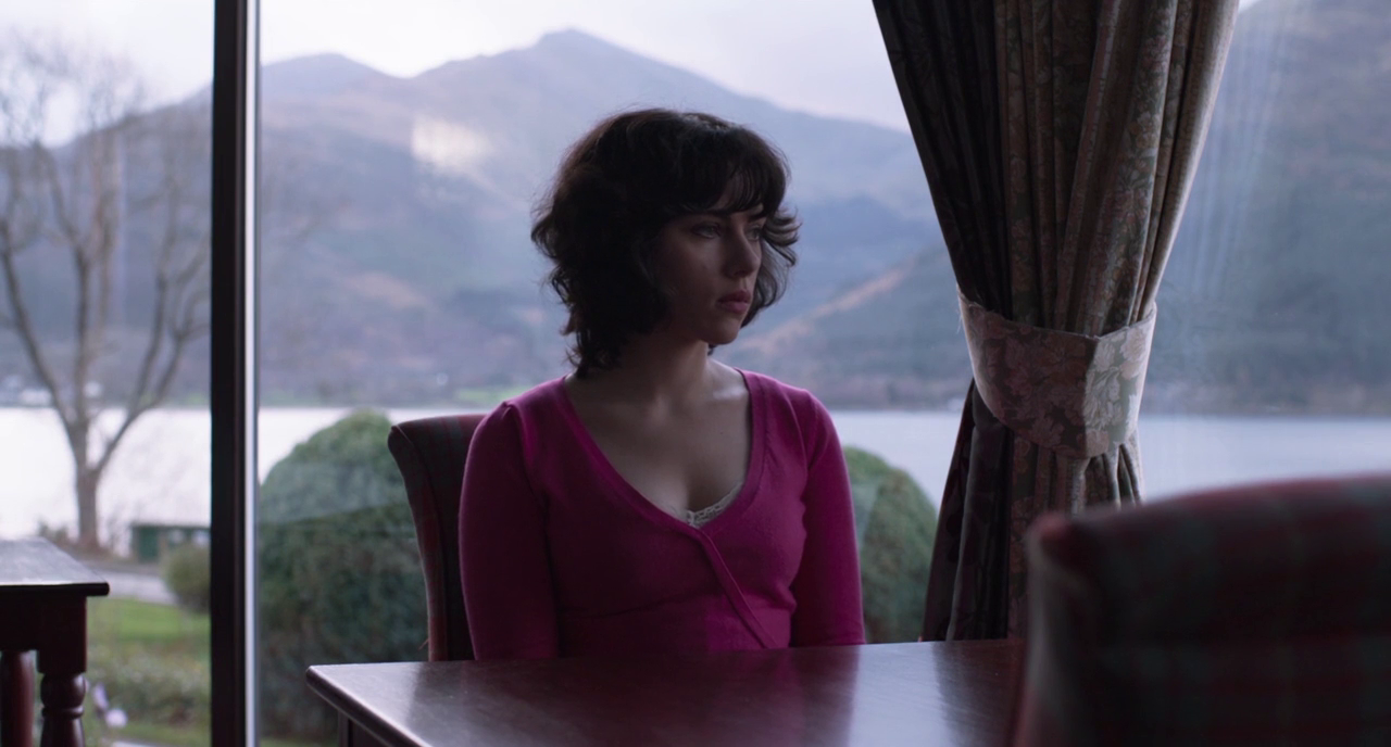
So it doesn't really matter where in the film that clip comes, all you need to know is that it's very personal to the character, and vital to the self discovery that you're going to be following along. But before we get into any of that, there's the opening shot (that I left in purposefully, and is a clean break off from the scene/settings just before this clip). This is pretty much standard for this film, there are some absolutely beautiful landscape shots throughout, and they give an incredibly mysterious air to the Scottish setting, and in a way, it aids the sci-fi aspect of what is otherwise a narrative fairly based in reality. Shots like these remind me ever so slightly of a less blue Prometheus, but that's about the only comparison I'm going to make. Prometheus is pretty and very little else in my view.

Under the Skin (2013)

Now the narrative of this little segment, the self realisation that the lead character is unable to truly be as human as the people around her. It's essentially a little bit of envious people watching from a POV perspective followed by some really intensely held shots as she tries to fit in. There's a conscious decision to string out that moment as long as possible, only two camera angles, and a lot of chew time. Never thought that would be a thing that I'd ever type. It's a proper realisation moment, where she realises that she's never going to be able to fit in properly with humanity, outlined by some of the reactions when she nearly throws the cake up.


Now technically, I think this scene is silently stunning, there is very little in the way of sound, so much so that at times in the wrong environment it's possible to think that it's muted. But then it feels in no way unnatural also to me. The location and setting lends it's self to that level of silence, and there's very little visibly diegetic in the scene that you expect to hear. It's a prime example of well used minimalism which fits in nicely with a number of other scenes throughout the film. The only sounds you really hear surround the eating of the cake, cutlery on china plate, and gagging on the food, with the rest of the visible diegetic sound you'd expect (maybe those cars in the background, or the rest of the people in the established open space) blend seamlessly into the background.

So that's pretty much it. It's not an expansive spectacle of a scene, or part of a scene, but there's a lot packed into such a small segment in terms of exposition, and that's what impresses me hugely about this film. The entire piece contains very little in the way of expositional back story, flashbacks or dialogue, and focuses on showing you everything you need to know through the performance and the interactions. It just stuck with me, after my first viewing, and the getting the bluray of it gave me another chance to sit back and properly understand what's happening. I openly accept that it's not the sort of thing you can half watch, or spend part of your concentration on, you need to be fully involved, and that's a pretty brave thing considering the habits of some film audiences these days.

Oh yeah, and the soundtrack really abrasive so listen to by itself, but incredibly fitting to the picture, and properly completes the work of art.

Now, you've been good enough, have a couple more locational stills. Not all of them though obviously, don't want to spoil it for people!


Three of the many beautiful location wides. Paintings the lot of them.

Anyway, that's me over and out, don't let the Scottish accents turn you off from watching it ;)

Tuesday, 3 March 2015

A little about Chalk

So here's a bit of a personal project update.

Just under a year ago, a team of us were prepping to head off and shoot our graduation film on the South coast. Three months later and we have ourselves a final product, a 20 minute film that's flawed in a number of ways, but we're thoroughly proud of all the same.


Promotional still, Best Actress nomination for Skye Bennett as 'Annie'
So far it's been accepted into festivals in Bucharest and LA, along with receiving a nomination in the Drama category in the RTS London Student awards. The LA shorts festival is in fact the latest of these acceptances, and also comes with a number of individual category awards:

Best Cinematography: Alex Smith
Best Actress: Skye Bennett
Best Supporting Actress: Amber Anderson
Best Makeup and Hair: Marianna Lazarowa. Suzanna Forrister-Beer & Rachel Coenen


Huge congratulation to all those who've been nominated in individual categories, and I hope to update with some good news regarding the nominations after the festival takes place on/around March 15th! 

In the meantime, here's the teaser we put together to promote the film, and HERE is the facebook page to keep up to date with all Chalky goings on. 

 
Chalk - Teaser Trailer from blackeye on Vimeo.

Saturday, 28 February 2015

A case for the fuller frame?

Now, this is another cheat sort of post thing, and not along with the main premise of the blog, but it hit me, and I got it down here because otherwise I'd forget, because that's what happens to people that don't carry around notebooks with them at all times. I might get a notebook.

The next post will be about what this was actually set up for and not just a random one of these. Promise.

Anyway, this hit me while I was watching Birdman, which I may or may not have raved about ever so slightly last time I put something up here, but it was on screen and it just looked so good for some reason. Then it just dawned on me, it was 16:9.

Now, I'm not going to assume everyone knows what I'm on about when I say 16:9 and 2.35:1, but then I know that a pretty much everyone actually will, so here's literally the briefest explanation I can muster:

It's the aspect ratio of what you're watching. Pixel Width : Pixel Height. It doesn't matter about resolution of the image at all, could be any size at all, but what you're watching will usually appear in one of those two aspect ratios. The differences shown below:


16:9 - Shelter from the Storm Commercial (2014)
2.35:1 - Chalk (2014)

Now both of these stills are from tracking shots which I gripped, both are tracking backwards, and both have the intention of revealing the surroundings. It seems both have the same colour walls, I'd never noticed that before...

So, these two reveals, I remember what was outside the frames, and the massive time pressure associated with getting the chalk shot done, and the relatively easy time we had with Shelter. This is in comparison, both shots were tricky to get to their final form in their own rights.

So looking at those two as examples, I kinda feel like I like the 16:9 frame better? It's just a lot more... Full? Despite the fact that the still is closer to the subjects, and you are physically seeing a lot less of the space, the frame feels a lot fuller content wise. And I don't mean this in the way that the room seems emptier, here's another comparison for you.


16:9 - Under the Skin (2014)


2.35:1 - V for Vendetta (2005)


Now here's pretty much the exact opposite scenario, both of these stills contain just over half of the subject, and the 2.35:1 shot has a lot lot more to look at within the fame. Under the Skin arguably is the less interesting shot in terms of content, but, does anyone else feel a little short changed with V for Vendetta? The height and content of the still from Under the Skin feels a tad more gratifying to me, with a far nicer about of content, and I'll crop it down myself, leave in as much of the content and leave it below to see if you can see what I'm rambling on about.


Here's the exact same shot, but cropped down to the 2.35 aspect ratio

Now are you able to to almost understand what I'm explaining terribly? You may only be missing a little bit off the bottom of the steering wheel and the jacket, along with a touch off the top of the head and part of the van window frame, nothing special. Especially in a space quite this confined, I can really see why they went for the frame size at which they shot, it feels inclusive, intimate, and gives a far nicer representation of the space. I'd love to see more of the arches at the top of frame, and the make up of the table in that V for Vendetta still. I just feel like there's something I'm missing out of in that room, and I'm well aware that it may be because I've seen the film a number of times and my eyes are a-wandering to take a bit more in.

Below I'm going to shove in a still from Transcendence, which, when I watched it I thought it was alright, but could've been a lot grander in terms of scale. Some of the sets were lovely, some of the set pieces were rather impressive in ideas, but personally, I'd have liked to see it 'play out a bit taller'.


2.35:1 - Transcendence (2014)
Now I'd want more sky, more ground, and to feel like that event is immersing me. I know that in a cinema that's exactly what happens, but in a world where people can watch these things either on a screen a few stories tall, or small enough to fit in your pocket, the thinking may have to change slightly.

(It wont, I'm typing this out from an armchair in my room with very little in the way of readership (viewership?) and no platform for this to make an actual argument)

That shot from transcendence, along with other shots from the big white laboratory that's featured fairly heavily in the latter half of the film could do with being shown off a bit more, but without losing the kind of shot intimacy, if you get my meaning. The distance from any character (if they appear in the scene) is deliberated over hugely both in the planning stage, and during the editing process (god is it debated during the editing process sometimes), but you shouldn't have to compromise by moving nearer to them or further away, why not just expand the frame up & down?


16:9 - Pacific Rim (2013)


16:9 - Birdman (2015)

Couple more examples of the fuller frame, one, Pacific Rim; a bit of a blockbuster about huge robots hitting huge aliens, and the other, Birdman; a multi award winning story following an actor coming to terms with life after superstardom. Not entirely sure how they could be linked in any way whatsoever, but aesthetically, pack the screen with colour, and there's very little setting them apart from those specific moments. Pacific Rim relies heavily on CGI yes, but in essence we capture as much of the vibrancy and energy of their depiction of Hong Kong, whilst still being fairly into the action at street level. Technically I could probably praise Birdman forever, and that is not exaggerating. With that fuller frame they decide to give more to the viewer in every scene and every sequence. There are very few cuts, and the camera pulls in and out to not reveal immaculately dressed and lit sets, but spaces. The frame gives you the sense that if the camera were to suddenly tilt up, you'd still be captivated by what you see on the ceiling. You feel in the room with Batman Michael Keaton, and when you leave the room you feel in the building, and when you leave the building you're right by him on the street. Obviously there's no accounting for how I would have felt had they chosen for whatever reason to shoot 2.35:1, but I'm sure glad they didn't.

Now there's one argument that crops up a lot of the time which is something along the lines of:


"But 16:9 looks very TV"
Is there anything wrong with that? And what if films shoot in that format more commonly, will that kind of judgment continue to be made? I mean if both film and TV shoot in the same aspect ratio, what will look like what? Again, with the budgets of shows like The Walking Dead and Game of Thrones hanging about these days, what would be wrong with drawing style comparisons from those? As a young film maker I'm sure that kind of comparison would be seen as a huge compliment!


16:9 - The Walking Dead, Season 1 (2010)


16:9 - Game of Thrones, Season 3 (2014)

Now here's an opportunity for everyone who knows me to go "urgh, here we go again..." and shake their heads or whatever they do when I strike up about Batman, but Batman.


16:9 - The Dark Knight (2008)


16:9 - The Dark Knight Rises (2012)
So call me whatever you want, but I'm a huge fan of the way Christopher Nolan goes about his business, and the end products. Now these stills are BluRay copies of these two films, in which all the 16:9 sequences have been cropped down from their original IMAX film aspect ratios. This is 1.43:1, or in a closer comparison to what I've been blabbering on about so far, roughly 14:10, so closer still to a square frame. For me, the set pieces done like this (as displayed from the Dark Knight) are even more stunning than usual, and coupled with the IMAX cinema screens, completely and utterly engrossing. The interesting part is that after the overall success of this film, Nolan decided to employ the format in closer, dialogue heavy, action set-piece lighter scenes, and I don't think it detracts from them at all. And I see the format jumping from scene to scene as personal preference, personally I didn't really notice it that much and it didn't affect me, but then I was with one or two individuals who found it rather jarring. So each to their own on that front I guess. But either way, I reckon it's quite brave to move from 2.35:1 to full frame.

And just one more thing before I go.


2.35:1 - Batman Begins (2005)

During the screening of The Dark Knight Rises they had flashbacks to this scene from Batman Begins, which didn't employ any IMAX cameras at all, and was shot at the same aspect ratio all the way through. Seeing it on the biggest of the big screens though, I couldn't help but think, what would it be like with that little bit more?

So there you have it, a little bit about my own personal preferences with framings, and a load of rambling on clearly outlining why I'm not a cinematographer...

Oh, and a full post on aspect ratio without once mentioning The Grand Budapest Hotel, not bad eh?


No, wait, there it is.... 4:3, why not?

Edit: I've been informed that Birdman was shot at 1.85:1 instead of 16:9, same principles still apply, just my eyesight that's dodgy.

Thursday, 26 February 2015

A Prologue to Birdman.

So here's a very little segment to tide you over until I next bother to enter anything bulky.

Technically it's not in the boundaries of the rules because it's not directly referencing a clip from a film, but then again, the clip that I am about to make reference to is less than a minute long, and to read the other article wouldn't take up the remaining 2 minutes, so I say it counts, it's an info piece. 

Or something.

I'm going to call this 'A Prologue to Birdman', as it's still available for viewing in cinemas (Go. Seriously.), and then I'll come back to it after having a bit of time off to think about what I most enjoy about the film and which section I'll choose.

Ah who am I kidding. It'll be THAT camera move, watch this space.

Anyway, THIS is going to be more of a post to just get you to watch out for the style the film follows, and the amount of admiration I have for the people pulling it off, both in front and behind the camera. It's a properly ballsy, but oh so beautiful way to shoot a film, with the long sweeping takes that remove the needs for multiple cuts as everything is covered in a motion, and you feel like the narrative is being conveyed as well as any other film, but without the need for much in the way of selective editing. If this catches on then part of what my friends and I do for people will be redundant, please don't catch on.

So the reasons for giving it a huge pat on the back, the planning, narrative wise with the blocking of scenes to convey the story, along with technically pulling off such a feat from the point of view of the camera being in the right spot, and everything being lit correctly and balanced for no need to change camera settings (I'd assume anyway, not sure if you could or would auto rig the camera so someone on a monitor could change settings in motion?).

So yeah, go watch Birdman while you still have the chance, and after reading about this you wont end up doing what I did and spend the first 10 minutes of the film wondering how the bloody hell they managed to pull it off so well. 

Here's that article I mentioned. Have a read, have a watch, enjoy it and go provide some much needed capital to people providing quality products to the global film industry!

Yes these posts need more pictures. I'll sort it out.