The next post will be about what this was actually set up for and not just a random one of these. Promise.
Anyway, this hit me while I was watching Birdman, which I may or may not have raved about ever so slightly last time I put something up here, but it was on screen and it just looked so good for some reason. Then it just dawned on me, it was 16:9.
Now, I'm not going to assume everyone knows what I'm on about when I say 16:9 and 2.35:1, but then I know that a pretty much everyone actually will, so here's literally the briefest explanation I can muster:
It's the aspect ratio of what you're watching. Pixel Width : Pixel Height. It doesn't matter about resolution of the image at all, could be any size at all, but what you're watching will usually appear in one of those two aspect ratios. The differences shown below:
 |
| 16:9 - Shelter from the Storm Commercial (2014) |
 |
| 2.35:1 - Chalk (2014) |
Now both of these stills are from tracking shots which I gripped, both are tracking backwards, and both have the intention of revealing the surroundings. It seems both have the same colour walls, I'd never noticed that before...
So, these two reveals, I remember what was outside the frames, and the massive time pressure associated with getting the chalk shot done, and the relatively easy time we had with Shelter. This is in comparison, both shots were tricky to get to their final form in their own rights.
So looking at those two as examples, I kinda feel like I like the 16:9 frame better? It's just a lot more... Full? Despite the fact that the still is closer to the subjects, and you are physically seeing a lot less of the space, the frame feels a lot fuller content wise. And I don't mean this in the way that the room seems emptier, here's another comparison for you.
 |
| 16:9 - Under the Skin (2014) |
 |
| 2.35:1 - V for Vendetta (2005) |
Now here's pretty much the exact opposite scenario, both of these stills contain just over half of the subject, and the 2.35:1 shot has a lot lot more to look at within the fame. Under the Skin arguably is the less interesting shot in terms of content, but, does anyone else feel a little short changed with V for Vendetta? The height and content of the still from Under the Skin feels a tad more gratifying to me, with a far nicer about of content, and I'll crop it down myself, leave in as much of the content and leave it below to see if you can see what I'm rambling on about.
 |
| Here's the exact same shot, but cropped down to the 2.35 aspect ratio |
Now are you able to to almost understand what I'm explaining terribly? You may only be missing a little bit off the bottom of the steering wheel and the jacket, along with a touch off the top of the head and part of the van window frame, nothing special. Especially in a space quite this confined, I can really see why they went for the frame size at which they shot, it feels inclusive, intimate, and gives a far nicer representation of the space. I'd love to see more of the arches at the top of frame, and the make up of the table in that V for Vendetta still. I just feel like there's something I'm missing out of in that room, and I'm well aware that it may be because I've seen the film a number of times and my eyes are a-wandering to take a bit more in.
Below I'm going to shove in a still from Transcendence, which, when I watched it I thought it was alright, but could've been a lot grander in terms of scale. Some of the sets were lovely, some of the set pieces were rather impressive in ideas, but personally, I'd have liked to see it 'play out a bit taller'.
 |
| 2.35:1 - Transcendence (2014) |
(It wont, I'm typing this out from an armchair in my room with very little in the way of readership (viewership?) and no platform for this to make an actual argument)
That shot from transcendence, along with other shots from the big white laboratory that's featured fairly heavily in the latter half of the film could do with being shown off a bit more, but without losing the kind of shot intimacy, if you get my meaning. The distance from any character (if they appear in the scene) is deliberated over hugely both in the planning stage, and during the editing process (god is it debated during the editing process sometimes), but you shouldn't have to compromise by moving nearer to them or further away, why not just expand the frame up & down?
 | ||
| 16:9 - Pacific Rim (2013) |
 |
| 16:9 - Birdman (2015) |
Now there's one argument that crops up a lot of the time which is something along the lines of:
Is there anything wrong with that? And what if films shoot in that format more commonly, will that kind of judgment continue to be made? I mean if both film and TV shoot in the same aspect ratio, what will look like what? Again, with the budgets of shows like The Walking Dead and Game of Thrones hanging about these days, what would be wrong with drawing style comparisons from those? As a young film maker I'm sure that kind of comparison would be seen as a huge compliment!"But 16:9 looks very TV"
 |
| 16:9 - The Walking Dead, Season 1 (2010) |
 |
| 16:9 - Game of Thrones, Season 3 (2014) |
Now here's an opportunity for everyone who knows me to go "urgh, here we go again..." and shake their heads or whatever they do when I strike up about Batman, but Batman.
 |
| 16:9 - The Dark Knight (2008) |
 |
| 16:9 - The Dark Knight (2008) |
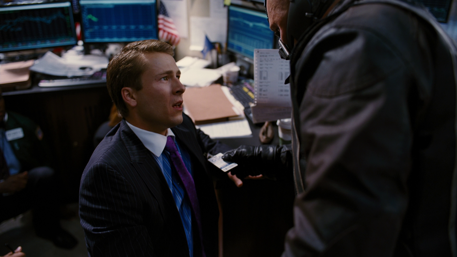 |
| 16:9 - The Dark Knight Rises (2012) |
 |
| 16:9 - The Dark Knight Rises (2012) |
And just one more thing before I go.
 | ||
| 2.35:1 - Batman Begins (2005) |
So there you have it, a little bit about my own personal preferences with framings, and a load of rambling on clearly outlining why I'm not a cinematographer...
Oh, and a full post on aspect ratio without once mentioning The Grand Budapest Hotel, not bad eh?

No, wait, there it is.... 4:3, why not?
Edit: I've been informed that Birdman was shot at 1.85:1 instead of 16:9, same principles still apply, just my eyesight that's dodgy.
No comments:
Post a Comment